AI code automation use case #1 — Design a home page using prompts
AI code automation use case #1 — Design a home page using prompts
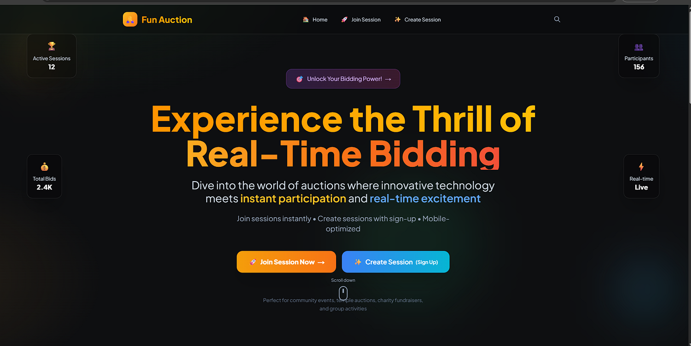
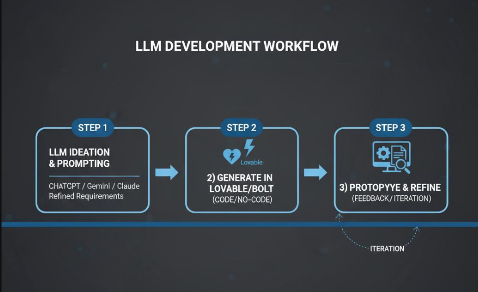
This post shows how to turn a homepage idea into working code with a large language model and a prompt‑driven builder. Tools like Lovable or Bolt read a short prompt and generate a runnable project in the browser. The plan is simple: draft a clear prompt with the LLM, paste it into the builder, and preview the result. Then iterate until the layout, copy, and brand details match the goal. The outcome is a responsive landing page with editable source code that ships fast and stays under full control.
Design a modern homepage with a strong hero, crisp value props, social proof, and a clear call to action. Capture requirements as prompt bullets: brand tone, colour system, information hierarchy, accessibility, and responsive behaviour. Generate the first version, review it in the live preview, and refine with tighter prompts. Commit the code and keep improving as the product story evolves. By the end, the workflow delivers a prompt‑to‑page experience that reduces build time and keeps maintainability high
Step 1: Discuss the idea with an LLM [Chat GPT/ Gemini / Claude]
- If you have an app idea, brainstorm and jot down the requirements in a notepad.
- Clear with your front-end tech stack. In this example, I have chosen NextJS, Tailwind CSS.
- To get the home page inspiration, use websites like Dribbble
For this use case, I have chosen the below landing page for my inspiration
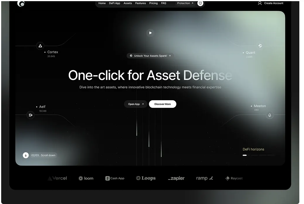
After multiple iterations with ChatGPT, the final prompt looks something like below:
Project Overview
Create a modern, high-end auction application homepage with the exact same visual styling and aesthetic as the reference. This is a premium, dark-themed application with sophisticated gradients, glassmorphism effects, and smooth animations.
Design System & Styling Requirements
Color Palette
- Primary Background: Dark slate (#0e0f11) with subtle radial gradients
- Card Backgrounds: Semi-transparent white (rgba(20,22,26,.55)) with backdrop blur
- Borders: Subtle white transparency (rgba(255,255,255,0.1))
- Accent Colors:
- Amber/Orange gradients (from-amber-400 via-orange-500 to-red-500)
- Blue/Cyan gradients (from-blue-500 to-cyan-500)
- Purple/Pink gradients (from-purple-500 to-pink-500)
- Text Colors: White, slate-100, slate-300, slate-400
Typography
- Font Family: Plus Jakarta Sans (300, 400, 500, 600, 700, 800, 900)
- Headings: Extra bold (900), large sizes (6xl-8xl)
- Body Text: Light to medium weights (300-500)
- Special Effects: Gradient text with bg-clip-text
Visual Effects
- Glassmorphism: backdrop-blur-xl, bg-white/5, border-white/10
- Gradients: Multiple gradient directions (to-r, to-br, to-b)
- Shadows: shadow-2xl, shadow-amber-500/25, shadow-inner
- Blur Effects: blur-3xl for background elements
- Transparency: Extensive use of opacity and rgba values
Layout Structure
Navigation Bar
- Fixed top navigation with glassmorphism effect
- Logo on left, navigation links on right
- Semi-transparent background with backdrop blur
Hero Section
- Full-screen height (min-h-screen)
- Centered content with large, bold typography
- Background decorative elements:
- Floating gradient orbs with blur effects
- Positioned absolutely with different animation delays
- Data nodes positioned around the hero (top-left, top-right, mid-left, mid-right)
- Interactive CTA buttons with hover effects and gradients
Features Section
- Grid layout (1 column mobile, 2 columns tablet, 3 columns desktop)
- Feature cards with:
- Icon containers with gradient backgrounds
- Hover animations (scale, translate)
- Glassmorphism styling
- Badge indicators (Free/Sign Up)
Footer
- Modern footer with glassmorphism effects
- Social links and company information
Component Specifications
Hero Section ComponentstypescriptApply to enhanced_saf...// Interactive Button Above Title- Gradient background: from-purple-500/20 to-pink-500/20- Border: border-purple-500/30- Hover effects: color changes and border opacity- Arrow animation on hover// Main Title- Font size: text-4xl sm:text-6xl lg:text-7xl xl:text-8xl- Font weight: font-black- Gradient text effect for "Real-Time Bidding"- Staggered animation delays*// CTA Buttons*- Primary: Amber to orange gradient with hover effects- Secondary: Blue to cyan gradient- Hover animations: scale, translate, shadow changes- Tooltips for secondary button**
Feature CardstypescriptApply to enhanced_saf...// Card Styling- Background: bg-white/5 backdrop-blur-sm- Border: border-white/10- Shadow: shadow-xl with hover shadow-2xl- Hover effects: scale-105, -translate-y-2// Icon Containers- Size: w-16 h-16- Gradient backgrounds for each feature- Hover scale effect: group-hover:scale-110- Inner shadows: shadow-inner shadow-black/20
Animation Requirements
CSS AnimationscssApply to enhanced_saf...@keyframes fadeInUp { from { opacity: 0; transform: translateY(30px); } to { opacity: 1; transform: translateY(0); }}@keyframes float { 0%, 100% { transform: translateY(0px); } 50% { transform: translateY(-20px); }}@keyframes fadeInUp { from { opacity: 0; transform: translateY(30px); } to { opacity: 1; transform: translateY(0); }}
Animation Classes
- animate-fade-in-up for content elements
- animate-float for background decorative elements
- Staggered delays: style={{animationDelay: '0.2s'}}
Responsive Design
- Mobile-first approach with responsive breakpoints
- Flexible grid systems that adapt to screen sizes
- Touch-friendly interactions for mobile devices
- Responsive typography that scales appropriately
Interactive Elements
- Hover effects on all interactive components
- Smooth transitions with duration-300 to duration-500
- Transform effects (scale, translate, rotate)
- Gradient overlays that appear on hover
- Shadow changes for depth perception
Background Effects
- Radial gradients positioned absolutely
- Blur effects for depth and atmosphere
- Floating elements with continuous animations
- Subtle transparency layers for complexity
Implementation Notes
- Use Tailwind CSS for utility classes
- Implement CSS custom properties for consistent theming
- Ensure smooth scrolling and performance optimization
- Add loading states and skeleton screens
- Include accessibility features (ARIA labels, focus states)
Quality Standards
- Pixel-perfect recreation of the reference design
- Smooth animations with 60fps performance
- Cross-browser compatibility (Chrome, Firefox, Safari, Edge)
- Mobile responsiveness across all device sizes
- Accessibility compliance (WCAG 2.1 AA)
Step 2: Use the prompt in a vibe coding platform [Lovable/Bolt]
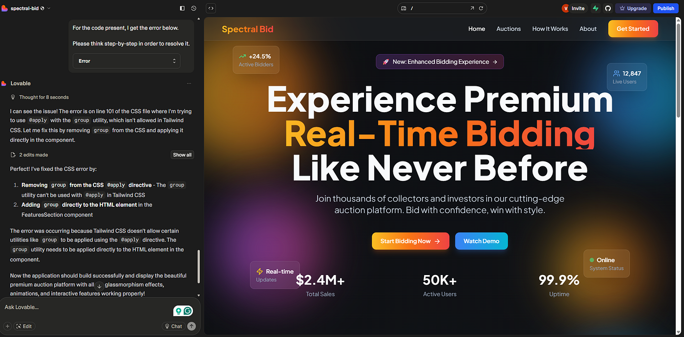
Paste the above prompt into Lovable. After executing, the output looks something like below.
Lovable platform output:
Step 3: Refine the application with your requirements
- Refine and iterate the app until all your requirements are met.
Wohooooo, Congratulations :) Now, you have successfully learned to design the web app home pages using AI.